In June 2021, I participated in the UCL Hacking the Climate event. My team's goal was to visualise the increasing risk of wildfires in the UK due to climate change. We utilised the Met Office's UK Climate Projections (UKCP18) data in the high emissions scenario, and our team decided to create a website to communicate our findings with a wider audience. We also decided that the UK needed an equivalent mascot to the USA's Smokey Bear, so say hello to Smokey Pigeon. We were awarded an honourable mention for our fire presentation (pun wholeheartedly intended), so check it out below. I contributed the following graphics and graphs to the presentation, and I had a blast working with my team.
Graphics
Some members of my team did a great job pulling in background research about wildfires to add context to the website. However, we wanted to keep the text on the website short and sweet, so I turned their research into some helpful graphics! The one to the right is based on the Scottish Government's criteria for a fire to be deemed a wildfire.
Of course, I heavily featured our mascot. The graphic below explains the process of converting weather data and into indicators of wildfire severity. It's based on a graphic from an academic paper, but I reworked the arrangement of the meteorological inputs.
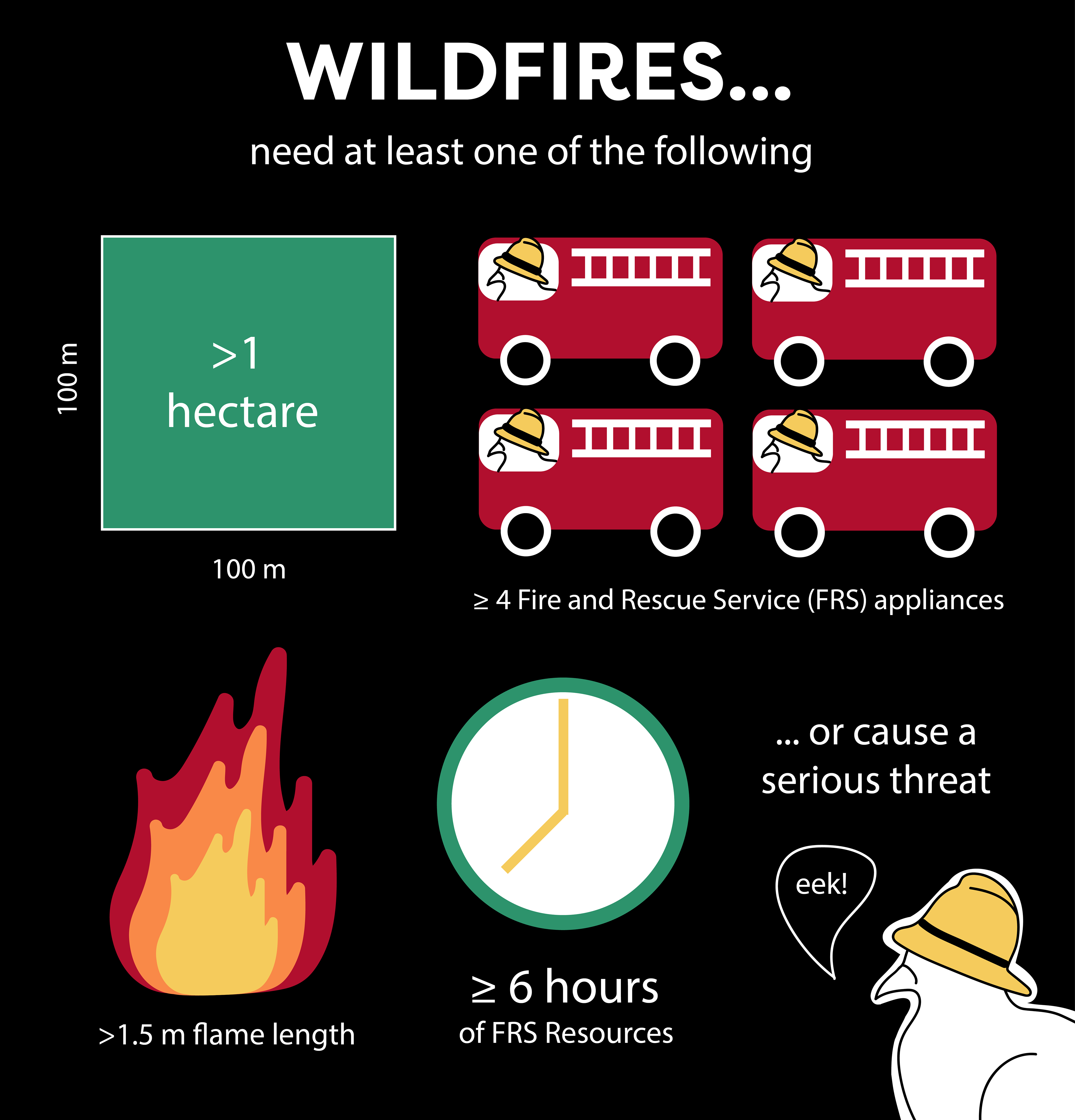
The Scottish Government (2013) ‘Fire and Rescue Service Wildfire Operational Guidance’. Available at: Fire and Rescue Service Wildfire Operational Guidance - gov.scot (www.gov.scot)
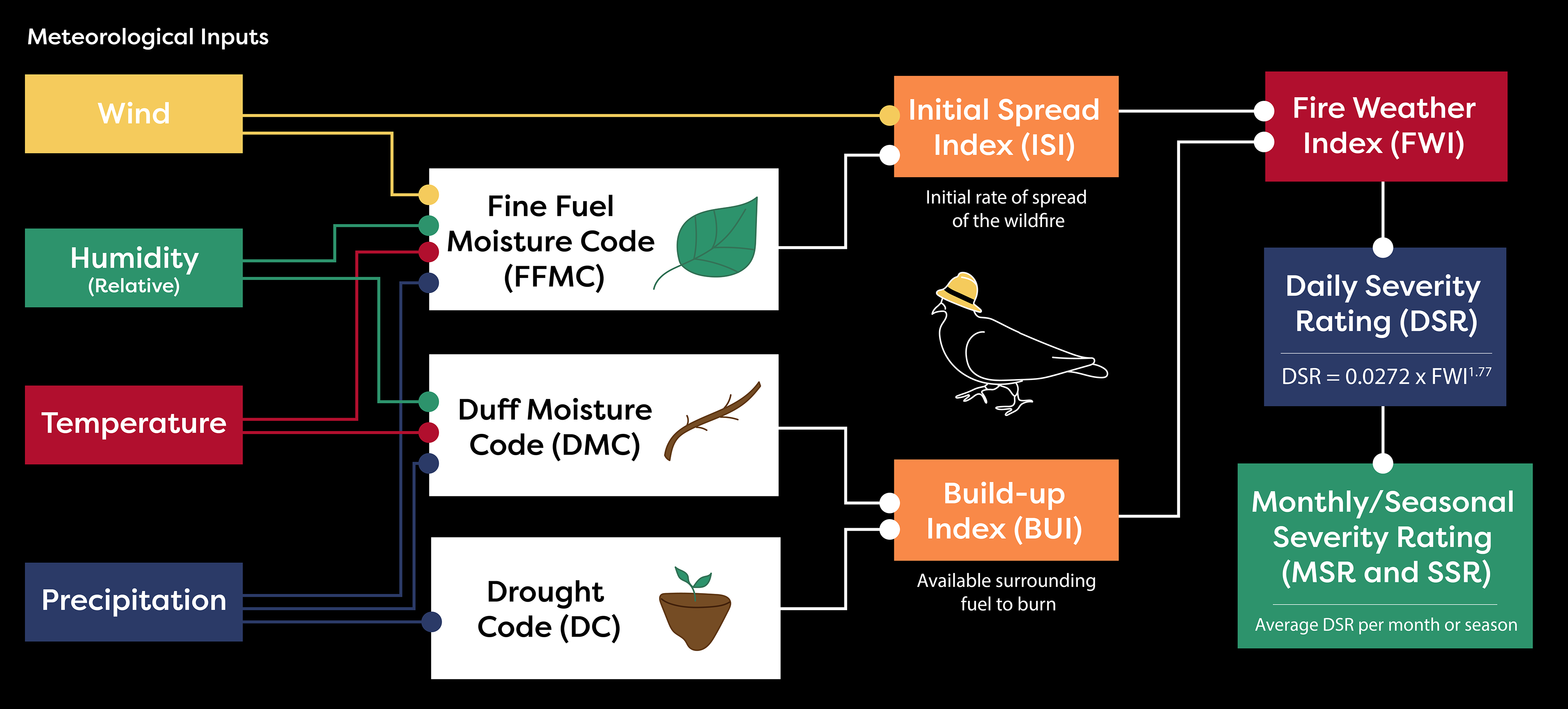
Based on a graphic from: Arnell, N. W., Freeman, A., & Gazzard, R. (2021). The effect of climate change on indicators of fire danger in the UK. Environmental Research Letters, 16(4), 044027.
The Fire Weather Index (FWI) represents the suitability of weather conditions for developing a wildfire if a fire is started. Then the daily severity rating (DSR) is a scaled version of the FWI used to represent the effect of local fire suppression efforts.
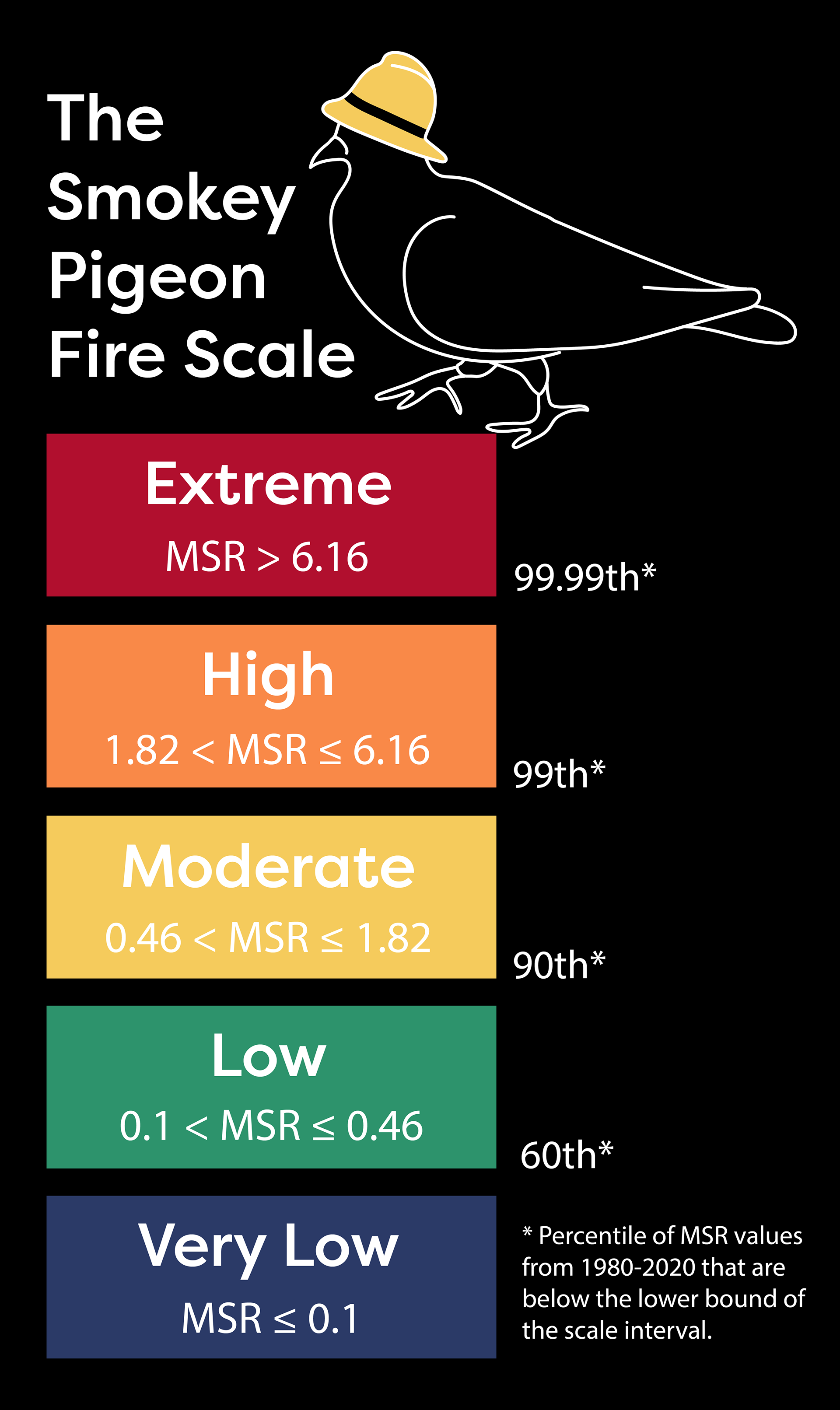
There was not much information available about what level of fire weather index (FWI) or monthly severity rating (MSR) would be considered high or extreme. So we derived our own scale based on the literature and the data from 1980 to 2020. This scale helps us divide the continuous MSR values into discrete bins.
Animated Graphs
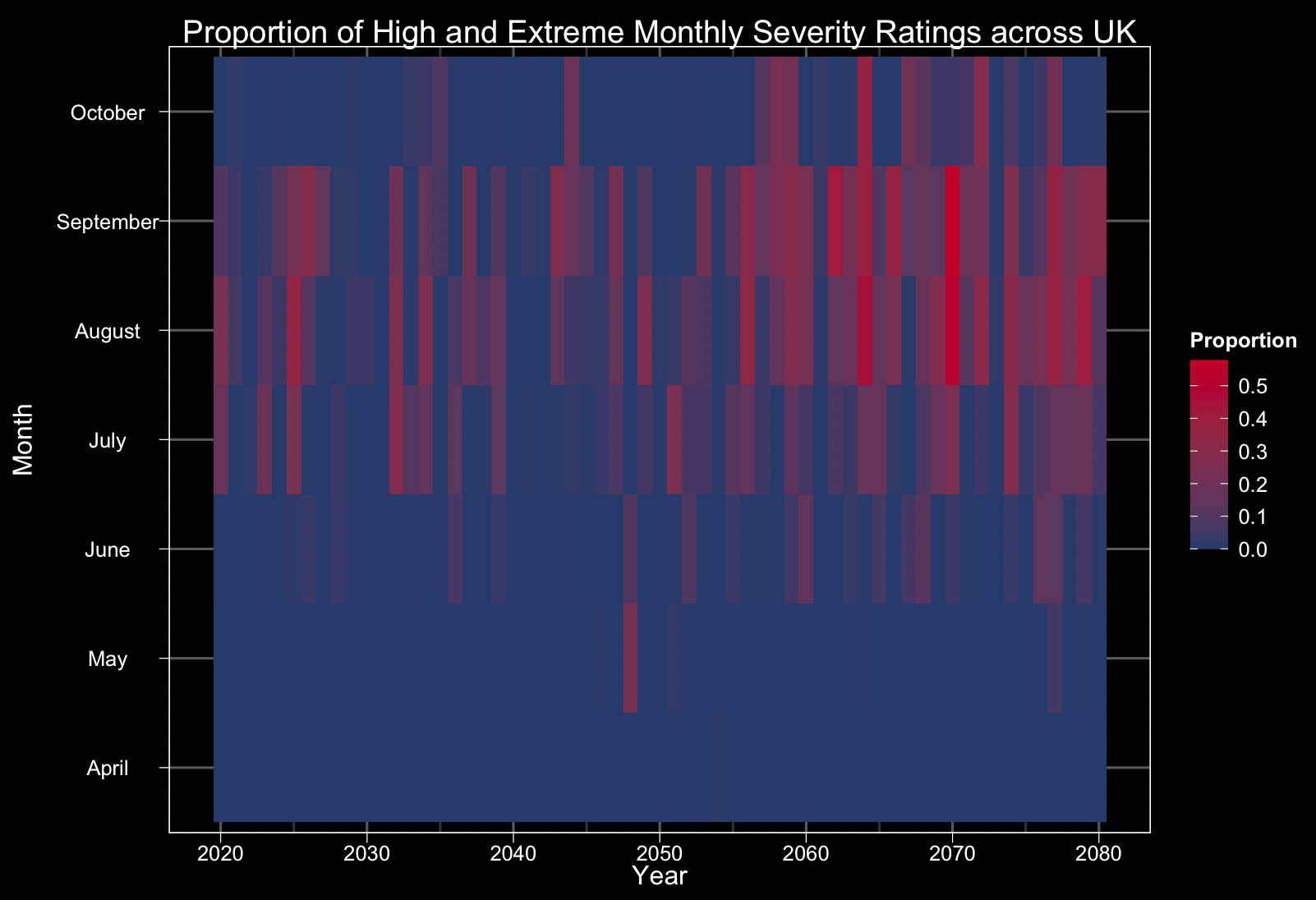
While other members of my team focused on mapping the UK fire ratings, I reduced the dimensionality of our data to look at the maximum MSR values and the proportion of MSR values in the Smokey Pigeon Scale bins. I used the 'gganimate' package to turn my R ggplot graphs into gifs that iterate over the months in the year. If you are familiar with ggplot, gganimate was easy to integrate, and animating the data is a great way to make scientific graphs more engaging.
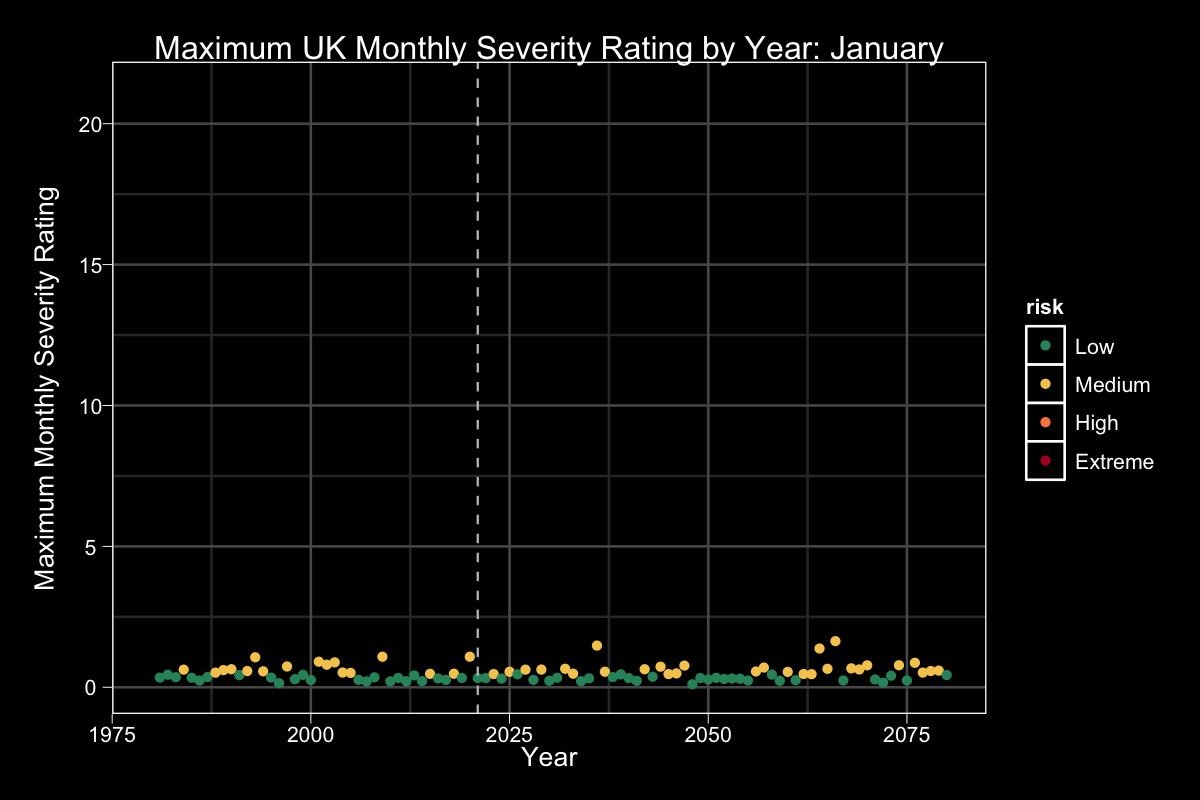
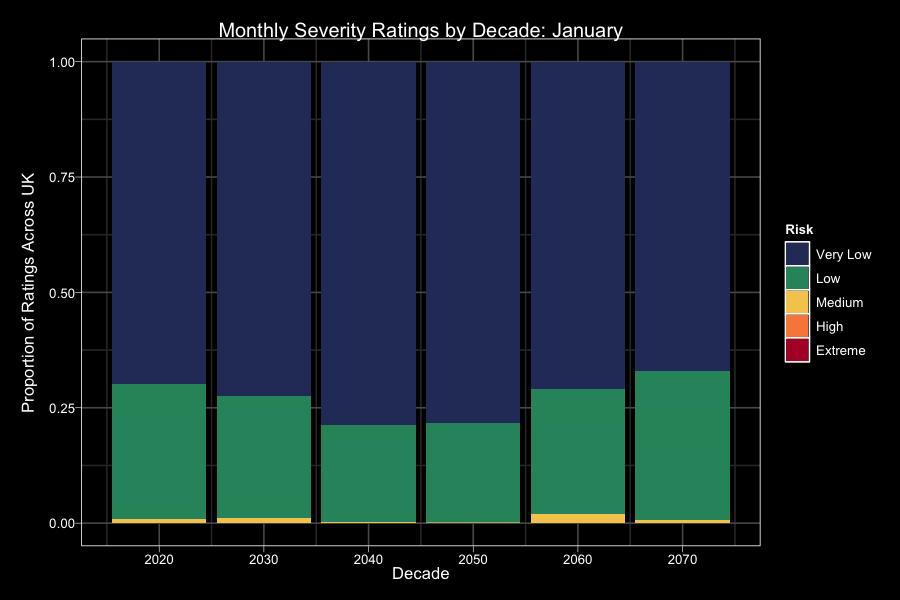
The graph on the left highlights the seasonality of fire ratings, and shows that there are higher expected maximum UK MSR values in the summers of later years. Looking at the proportion of MSR values in the Smokey Pigeon scale, there are larger proportions of extreme and high values in later decades.
As time goes on, under the high emission scenario, the UK is expected to see a higher proportion of 'high' and 'extreme' values (MSR > 1.82). In particular, for August and September of 2070, the climate projections suggest that more than 50% of the MSR values across the UK would be at these higher levels.
To learn more about wildfires and our project, click the button below!